One Input to Rule Them All: Smarter Dashboards with Simple Controls (Tableau and Power BI)
When you’re building dashboards, especially the kind people want to use, one of the most useful tricks in the book is using a single control to drive multiple elements. Whether you’re working in Tableau or Power BI, both tools let you do this, just in slightly different ways.
Different use cases include:
- Switch Between Data Types or Business Units
- Language or Locale Selection
- Time Granularity Selector (Month, Quarter, Year)
- Pick Your KPI
- What-If or Scenario Testing
- Switch Perspectives (Executive vs. Operational)
Why This Is So Useful
Having one control keeps things simple, clean, and easy to navigate.
From the builder’s side, it’s also a huge win: fewer visuals to maintain, fewer things to break when the data or logic changes, and much better scalability when stakeholders inevitably ask for “just one more metric.”
Both Tableau and Power BI make this kind of flexibility possible:
- In Tableau, you’d use parameters and calculated fields to drive your views, often combined with Show/Hide containers to swap visuals on the fly.
- In Power BI, it’s about using a disconnected table, a slicer, and some DAX to dynamically update visuals without duplication.
Walkthrough: Dynamic Metric Switching
Using the PEPFAR dataset for SADC countries (e.g. South Africa, Mozambique, Zambia), we want to let users select one indicator, like TB_STAT %, TB_STAT_POS %, Linkage % or HTS_TST_POS % — and have the entire dashboard update accordingly.
Let’s break it down for both Power BI and Tableau.
Tableau
- In Tableau’s Data pane, go to any blank space, and click the small dropdown arrow in the top-right of the panel and choose “Create Parameter…”. Set up the parameters as follows:
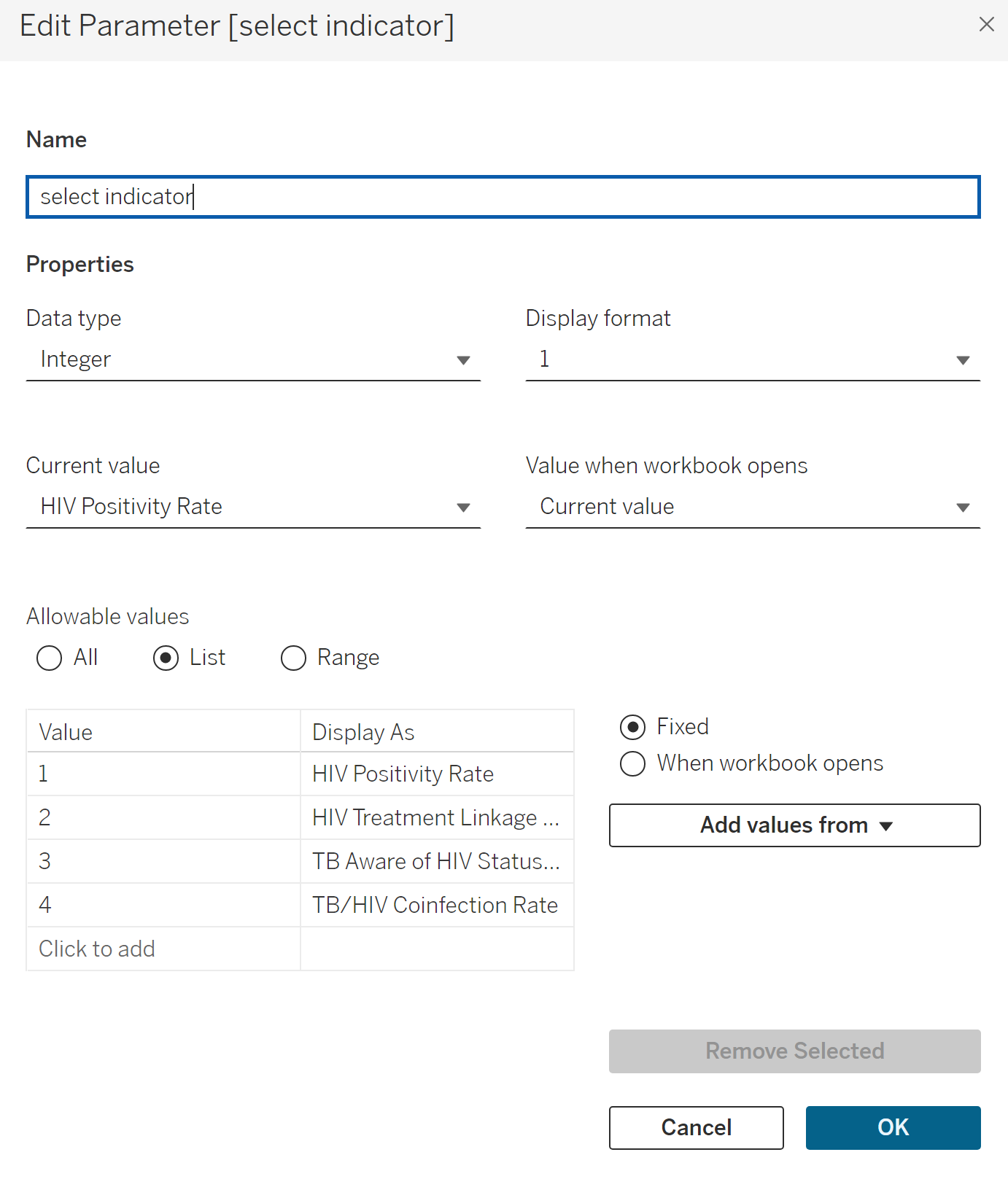
- Create the necessary calculations: typically including one for the indicator value, as well as separate ones for the numerator, denominator, and any relevant text fields. All calculations should reference the same parameter, ensuring the entire dashboard updates consistently based on a single selection.
First, create the values:
//Create three calculations

Indicator %

case [select indicator]
when 1 then [hiv_positivity_rate]
when 2 then [treatment_linkage %]
when 3 then [TB_STAT %]
when 4 then [TB_STAT_POS %]
END

numerator
case [select indicator]
when 1 then [HTS_TST_POS]
when 2 then [TX_NEW]
when 3 then [TB_STAT_N]
when 4 then [TB_STAT_POS]
END

denominator
case [select indicator]
when 1 then [HTS_TST]
when 2 then [HTS_TST_POS]
when 3 then [TB_STAT_D]
when 4 then [TB_STAT_N]
END
Next, create calculations for text:
//Create three calculations

Indicator description:
case [select indicator]
when 1 then "HIV Positivity %"
when 2 then "Linkage to Treatment %"
when 3 then "TB patients with known HIV status %"
when 4 then "TB patients who are HIV-positive %"
END

Numerator description:
case [select indicator]
when 1 then "Number of positive tests"
when 2 then "Number of newly enrolled in HIV treatment"
when 3 then "Number of TB patients with known HIV status"
when 4 then "Number of TB patients who are HIV-positive"

END

Denominator description:
case [select indicator]
when 1 then "Total tests conducted"
when 2 then "Number who tested positive"
when 3 then "Total patients with TB"
when 4 then "Number of TB patients with a known HIV status"
END- Build your charts and dashboard. Whenever you need to display a value or label that should respond to the parameter, use your calculated field instead of hardcoding a specific measure or dimension. This applies to tooltips as well; they can dynamically reflect the selected option using the same calculations.
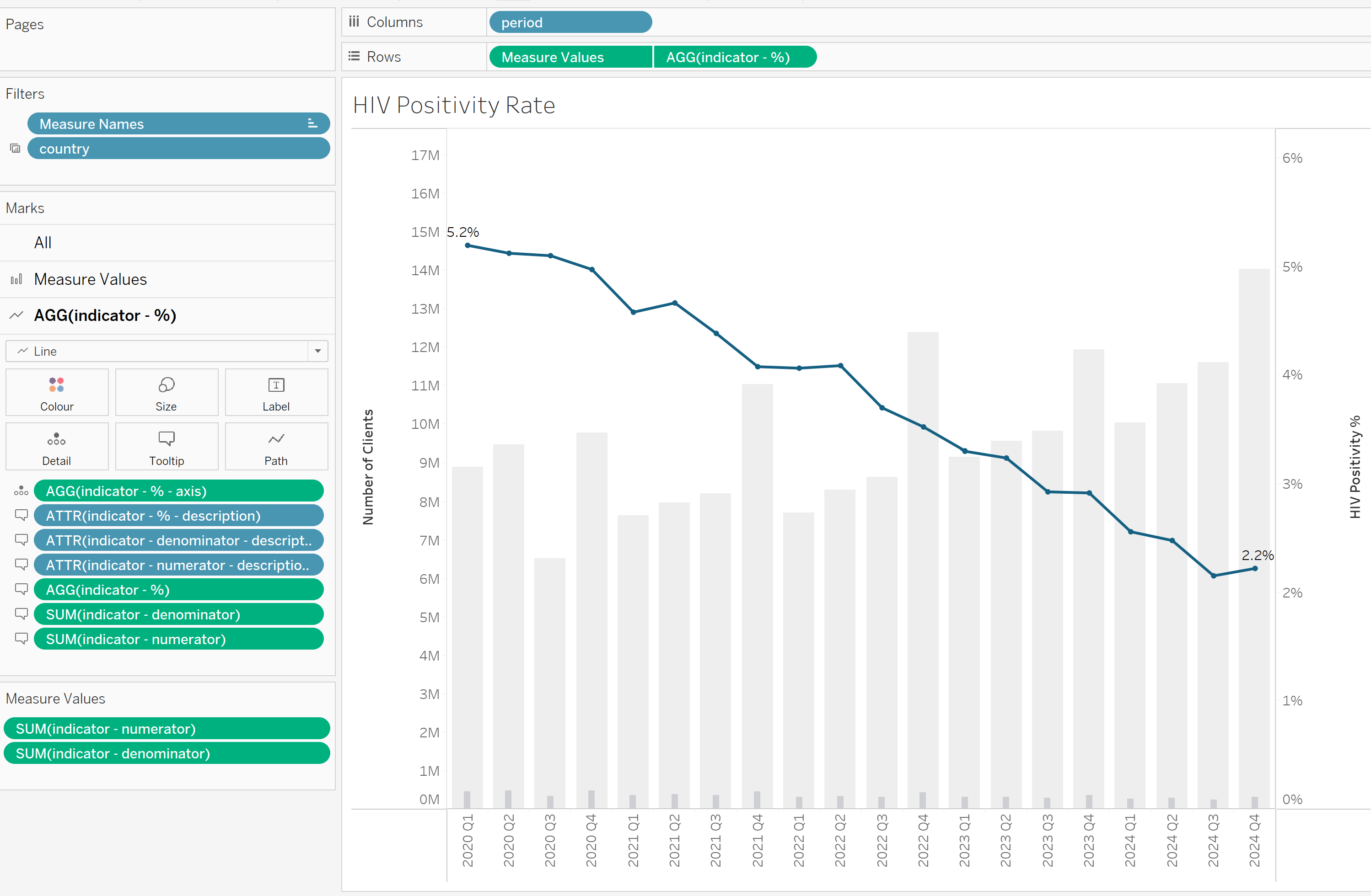
- Build the dashboard and add the parameter control to enable dynamic interaction.
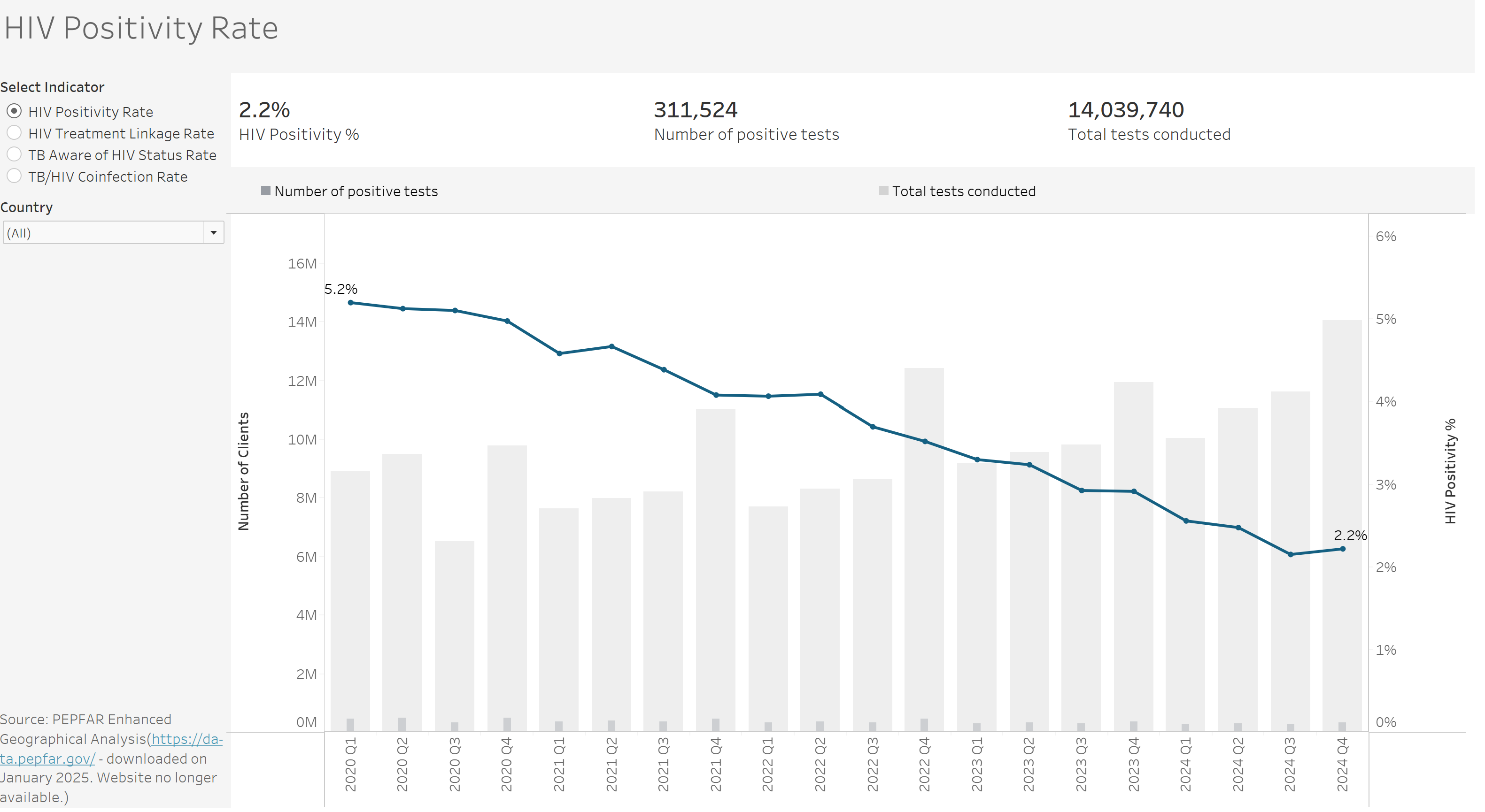
The live version is available on Tableau Public.

Power BI
In Power BI, achieving the same effect takes a bit more setup, but it is possible. There are a couple of approaches, but this walkthrough focuses on creating parameters using a disconnected table and DAX, a method that provides the greatest flexibility.
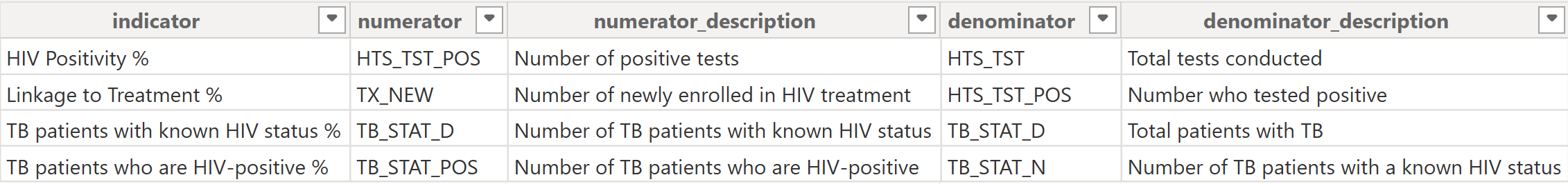
- Create a dataset in Excel with the necessary columns — in this example, five: indicator, numerator, numerator_description, denominator, and denominator_description. Include in these columns all the text and values you want the parameter to reference. Your dataset should look something like the example below.
- Import this dataset into Power BI as a separate table (via File → Get Data → Excel). There’s no need to create a relationship between this table and your main data model.
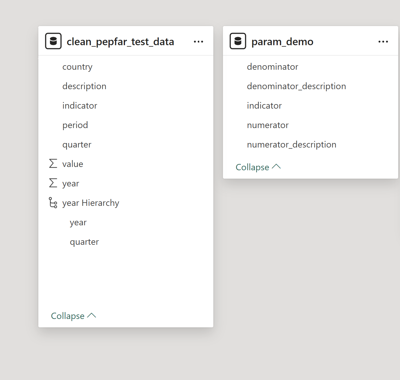
- Create a table to store your value and description calculations. In Power BI’s Model View, click New Table and enter the following formula to create a single-row, single-column table with a blank value:
param_demo = Row("Column", BLANK())This creates a table named param_demo with one row and a column called “Column” initialised as blank.
- Create your calculations by right-clicking the new table param_demoand selecting New Measure. Use a SWITCH statement in your DAX to reference values from your parameter dataset. This approach lets you dynamically control which measure or description is displayed based on the selected parameter. Below are the three calculations needed to update each value.
SelectedIndicator = SWITCH (
    SELECTEDVALUE ( param_demo[indicator] ),
    "HIV Positivity %", [HTS_TST_POS %],
    "Linkage to Treatment %", [linkage %],
    "TB patients with known HIV status %", [TB_STAT %],
    "TB patients who are HIV-positive %", [TB_STAT_POS %],
    BLANK ()
)

SelectedNumerator =
SWITCH (
    SELECTEDVALUE ( param_demo[indicator] ),
    "HIV Positivity %", [HTS_TST_POS],
    "Linkage to Treatment %", [TX_NEW],
    "TB patients with known HIV status %", [TB_STAT_N],
    "TB patients who are HIV-positive %", [TB_STAT_POS],
    BLANK ()
)

SelectedDenominator =
SWITCH (
    SELECTEDVALUE ( param_demo[indicator] ),
    "HIV Positivity %", [HTS_TST],
    "Linkage to Treatment %", [HTS_TST_POS],
    "TB patients with known HIV status %", [TB_STAT_D],
    "TB patients who are HIV-positive %", [TB_STAT_N],
    BLANK ()
)- Create your charts, slicers, and other visuals as usual. Instead of using the raw indicator fields from your dataset, use the calculated measures you created. Make sure to add a slicer linked to the indicator parameter; this slicer drives the calculations, so without it, your visuals will remain blank.
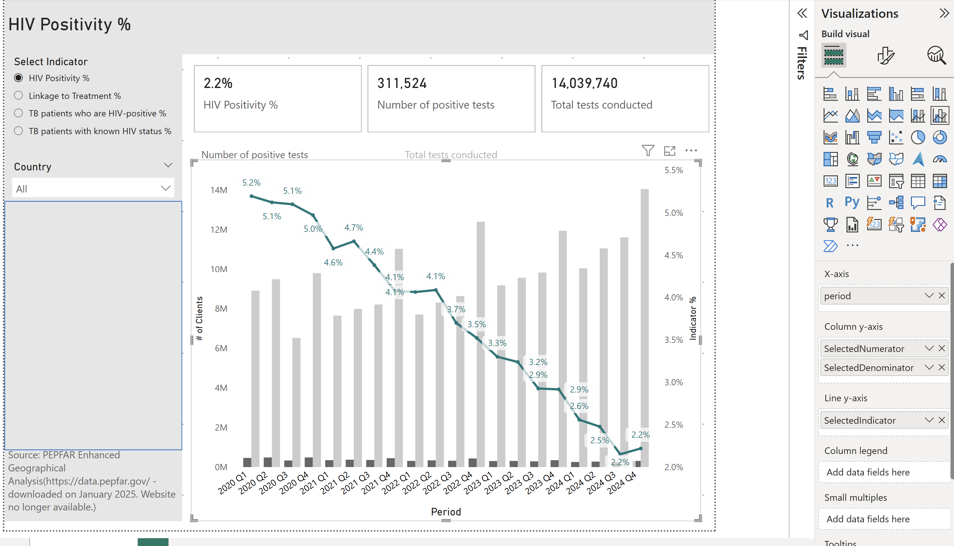
The live version is available online.
Both Tableau and Power BI have their strengths when it comes to using parameters.
Tableau offers great flexibility, allowing a single parameter to dynamically update multiple calculations across the dashboard. This makes it straightforward to create consistent, interactive experiences.
Power BI, meanwhile, lets you store parameter options in a dedicated table. This approach simplifies managing, documenting, and updating parameter values over time. However, in both tools, adding new logic typically requires manually updating calculations with SWITCH or CASE statements, so extending functionality means editing formulas directly.
A key challenge with Power BI is that setting up parameter-like controls, especially using external tables, is not very intuitive. Additionally, these controls can’t be used to dynamically update elements like axes or legends, which limits their flexibility. In contrast, Tableau’s parameter controls feel more integrated and user-friendly, making it easier to create seamless interactivity across the dashboard.